

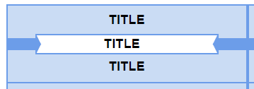
This is an example of the lack of centering that drove me crazy:
So, as I program web-based applications and interactive websites for a living, I figured I could do it better myself. I know SVG (vector art format), so for the last four months, about 10 hours a week on my daily commute to my office, I've been working on a website where I could enter my record info in, and select which ones I get titlestrips for.
At first, it didn't have a real good UI (and frankly, while it looks messy to you now, with things not lined up or centered, it was a LOT worse before), and I wanted to change some stuff around, so at this time, I ended up with this.
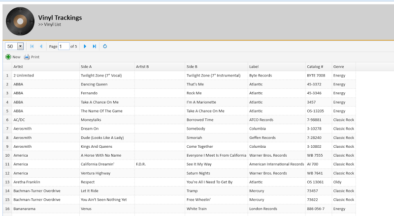
Here's a screen showing all the 45's I have in the system:
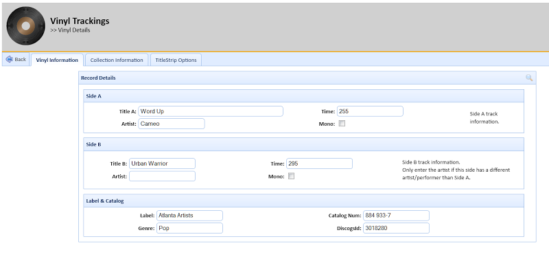
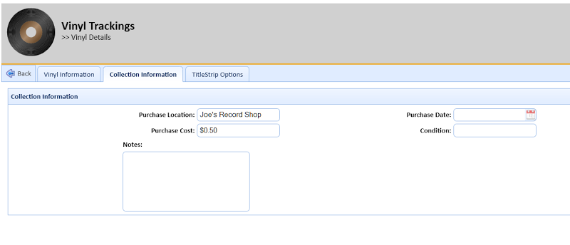
If you double-click on a record, you can pull up its details. The first two tabs contin information about the record, and any additional collection information:
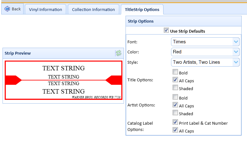
But the real reason I was doing this was so I could print out labels. So the last tab lets me define what the record's label will look like:
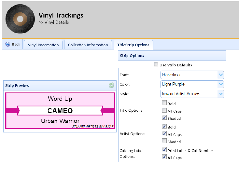
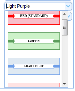
While it's not noticeable, I put most of my work in the code that generates that titlestrip. It handles double-artists on the fly (either adding a " / " between the two, or making them two lines based on layout, see below), and will automatically shrink the font-size or word-wrap to two lines and shrink to make the song fit and not run outside the boundaries. I made a lot of colors (some I ripped from online strip generators, one or two I made myself), and even added images to the selection boxes:
Code was added to generate selected records and add them to a page (with cut-lines!

At this point, I was finished .. with extras.. of everything I had wanted to do. However, I kept going, for some crazy reason. I started working on adding user support (i.e. support multiple users). I stopped mid-way, since I highly doubt anyone would be using this, other than myself.
But wanted to share, since I got the darn text centered:
That I essentially spent far, FAR too long doing something that.. really didn't need to be done.
